To complete this exercise, make three different
versions of the same image, together with a written explanation of what you
were trying to achieve, and an assessment of how well you think you have
succeeded.
------------------------------------------------------
Original
Image
 |
| Original Image |
It’s
quite a low dynamic image which I felt had lots of potential. I used a similar
picture in assignment 2 but felt I needed a different one to work on.
First
thing I always do is check the Histogram Levels to see how the main areas pan
out. Here there is lots of low contrast
and a block of dark tones, see below:
I
adjusted the black and the white tones to give the picture a bit more depth, i.e., black
from 0 to 14, mid-tones from 1.00 to 0.54 and white from 255 to 231:
Here’s my first completed image below:
------------------------------------------------------------
Second
Image
Rather than revert back to the original image I thought I would use the image I had just created as the start point for my second picture.
As per usual, I looked at the
Levels histogram first to see what had occurred after I had manipulated
the original image and could see that there was a more even spread of all the tonal
areas.
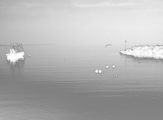
I’ve been exploring infra-red pictures lately and wanted to see if it was possible to change a simple greyscale image into an infra-red one through the options available. I worked my way through the menus and palettes under Image/Adjustments and thought that Selective colour might give some interesting changes. I opened it and saw that I was able to change the various colour areas but decided to concentrate on the blacks so moved the slider the whole way across from 0 to -100 and this, in one movement, gave me the image I was looking for.
Here’s the final image for Picture 2, very spooky especially with the bird flying through it:
Third
Image
For
my third picture I went back to the original image to create a sepia toned image
which could have been taken in the last century. I went back to my original image:
I
had to desaturate the picture as I had described in the previous section using
Image/Adjustment/Desaturate:
Once I had desaturated the image I checked to make sure it was still in the RGB Mode so that I could colorize it to a sepia tone. This was okay so I went to the Adjustments palette to add sepia colours. I had to tick the Colorize box and changed the Hue from 0 to 20, the Saturation box from 0 to 25 and left the Lightness at 0. This gave the image below:
I
used the Filter Gallery to add various effects but felt all the different styles
were superfluous to the original image. The
only effect that I did like was the neon glow but it was a bit too uncanny for
me.
So
the final image for me was the straight sepia toned picture:


No comments:
Post a Comment