Part 3 Processing the image
Wednesday, 21 March 2012
Completed Project work
Well, that's all the project work done, now all I have to do is come up with a theme for assignment 3 monotone.
Monday, 23 January 2012
Exercise 17: Colours into tones 2
The aim of this exercise is to make practical use of
channel adjustment to achieve a specific effect. Choose one of the following targets:
·
A landscape in which you emphasise the depth (aerial
perspective) by strengthening the visual effect of haze.
·
A portrait in which lightens the complexion without
significantly altering the tones of the rest of the image.
·
A picture of a garden in which the green vegetation
appears light in tone.
In addition to this, for comparison, also prepare the default black and white conversion offered by your software, for example, desaturate. Print the results in pairs (default conversion and your conversion.
-----------------------------------------------------------------
Original Image
My original image was a portrait
of a young Ethiopian girl who wanted some pictures for her book as she wanted
to break into modelling.
I wanted to compare the images side by side so I had to combine them in one file in Photoshop to get them to stay next to each other, see below:
I wanted to change Fartuun's skin tone to make it lighter so had to first select it by usine the magnetic selection tool and refining it in Quick Mask Mode.
Once I'd selected her face I used the sliders to adjust it to a much lighter colour
Darkened
Complexion
Once I had successfully changed just the facial colour I
wanted to change the original image to make Fartuun’s complexion darker, just to
see what happened and here’s the results:
I've enjoyed this exercise as it made me think about some new areas that I haven't really used before. One thing though, I've found that the key to changing pictures successful and without being obvious is very careful selection of the area to adjust. Once I had mastered the Quick Mask it became much easier.
Exercise 16: Colours into tones 1
Take or choose an image which contains at least two
strong contrasting colours. Using the
channel sliders or controls available in your software create two opposite
versions of the image in black and white.
In one lighten the greyscale tone of one of the colours and darken the
tone of the contrasting colour as much as possible. In the second version perform the
reverse.
To
begin with, make and save a ‘default’ black and white version and keep this as
a reference. You should aim to produce
two black and white versions with a strong difference in their tonal
distribution. Write down what effect
these different adjustment have on the creative quality of the image.
My original image was a picture of a tractor with strong orange and blue colourings
I
desaturated the image (Ctrl+Shift+U) and below is my default black and white
picture.
First Adjusted
Image
I
adjusted the red slider to increase the Reds/Oranges and got the result below:
Second Adjusted Image
I
went back to the original black and white image and adjusted the blue range and
achieved the image below:
You can see from the images above that by
increasing the red slider on the black and white option within Photoshop, it
lightens the red within the image, making it a pale grey. This obviously has
the reverse effect when decreasing the red slider; it then darkens that
particular colour within the image.
Now that I’ve completed this exercise I’ve got a
better grasp on how, by increasing tones it can influence other areas of
colour.
Thursday, 19 January 2012
Exercise 15: Black and white
Exercise
15 Black and White
Choose a subject. Lighting condition or picture
situation that you think may look better in black-and-white than in regular
colour. In shooting you should try to
ignore the colour element.
Compose and expose for the black and white version
that you will later process. Process the
image for black and white, and write down what effect shooting in black and
white had on your choices of subject, framing, details of composition and
exposure. Note the results in your learning
log.
Original
Image
My original image was a colour
portrait of a fellow student. I had to do some post processing as there was a
fairly obvious red area on his forehead which I removed with the help of the
Clone tool.
I
took the image with one soft box to the front left with a black background. There
is just a small catch light in his right eye but the light had been positioned
to throw the left side of his face in almost total darkness.
I
applied the Sharpening filter and then used the Desaturate control to change it
to black and white.
I
felt that this image was far stronger than the coloured images as the
discrepancies in Jan’s skin tones no longer distracted the eye from the main
overall image. The tee shirt also seems
more defined than as a coloured item. Generally
the image is much better in black and white than colour.
Tuesday, 17 January 2012
Exercise 14: Interpretative processing
Choose an image that you feel is open to different
creative interpretation(s) – an image with a lower dynamic range than usual
will give more opportunities for varied processing.
I
liked the dark and moody look that I had achieved so felt this would be a good
point to leave well alone.
Here’s my first completed image below:
------------------------------------------------------------
Rather than revert back to the original image I thought I would use the image I had just created as the start point for my second picture.
I
decided to desaturate the picture to turn it to black and white so went to
Images/Adjustments/desaturate and it changed to a grey scale picture. I had to be careful that that the Mode hadn’t
changed from RGB to Greyscale as this would have meant that I couldn’t
introduce any colours later on if I wanted to.
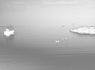
I’ve been exploring infra-red pictures lately and wanted to see if it was possible to change a simple greyscale image into an infra-red one through the options available. I worked my way through the menus and palettes under Image/Adjustments and thought that Selective colour might give some interesting changes. I opened it and saw that I was able to change the various colour areas but decided to concentrate on the blacks so moved the slider the whole way across from 0 to -100 and this, in one movement, gave me the image I was looking for.
Here’s the final image for Picture 2, very spooky especially with the bird flying through it:
----------------------------------------------------------
Once I had desaturated the image I checked to make sure it was still in the RGB Mode so that I could colorize it to a sepia tone. This was okay so I went to the Adjustments palette to add sepia colours. I had to tick the Colorize box and changed the Hue from 0 to 20, the Saturation box from 0 to 25 and left the Lightness at 0. This gave the image below:
To complete this exercise, make three different
versions of the same image, together with a written explanation of what you
were trying to achieve, and an assessment of how well you think you have
succeeded.
------------------------------------------------------
Original
Image
 |
| Original Image |
It’s
quite a low dynamic image which I felt had lots of potential. I used a similar
picture in assignment 2 but felt I needed a different one to work on.
First
thing I always do is check the Histogram Levels to see how the main areas pan
out. Here there is lots of low contrast
and a block of dark tones, see below:
I
adjusted the black and the white tones to give the picture a bit more depth, i.e., black
from 0 to 14, mid-tones from 1.00 to 0.54 and white from 255 to 231:
Here’s my first completed image below:
------------------------------------------------------------
Second
Image
Rather than revert back to the original image I thought I would use the image I had just created as the start point for my second picture.
As per usual, I looked at the
Levels histogram first to see what had occurred after I had manipulated
the original image and could see that there was a more even spread of all the tonal
areas.
I’ve been exploring infra-red pictures lately and wanted to see if it was possible to change a simple greyscale image into an infra-red one through the options available. I worked my way through the menus and palettes under Image/Adjustments and thought that Selective colour might give some interesting changes. I opened it and saw that I was able to change the various colour areas but decided to concentrate on the blacks so moved the slider the whole way across from 0 to -100 and this, in one movement, gave me the image I was looking for.
Here’s the final image for Picture 2, very spooky especially with the bird flying through it:
Third
Image
For
my third picture I went back to the original image to create a sepia toned image
which could have been taken in the last century. I went back to my original image:
I
had to desaturate the picture as I had described in the previous section using
Image/Adjustment/Desaturate:
Once I had desaturated the image I checked to make sure it was still in the RGB Mode so that I could colorize it to a sepia tone. This was okay so I went to the Adjustments palette to add sepia colours. I had to tick the Colorize box and changed the Hue from 0 to 20, the Saturation box from 0 to 25 and left the Lightness at 0. This gave the image below:
I
used the Filter Gallery to add various effects but felt all the different styles
were superfluous to the original image. The
only effect that I did like was the neon glow but it was a bit too uncanny for
me.
So
the final image for me was the straight sepia toned picture:
Tuesday, 10 January 2012
Exercise 12: Managing Tone
Excercise:
Choose
one image which is available in JPEG and RAW which needs some adjustments. Then
use your processing software to adjust both images to a satisfactory state.
JPEG
·
Set
the black point and white point· Assess and adjust the brightness of mid tones
· Assess and if necessary adjust the contrast
· If necessary make corrections to localised areas.
RAW
· Set the black and white points using Exposure
· Assess and if necessary adjust the brightness of the midtones
· Assess and if necessary adjust the contrast
· If necessary make corrections in localised areas
---------------------------------------------------------------------------------
JPEG
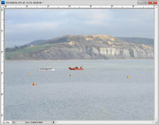
Original JPEG Image
 |
| Original Image |
Here’s my original image above taken in January 2012. The whole image is very low key apart from the two boats in the middle section.
JPEG
Procedures
Firstly,
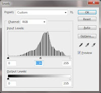
I opened Levels and you can see the original settings below.I set the sliders to be nearly touching the main parts of the histogram
 |
| Black and white sliders adjusted |
Now
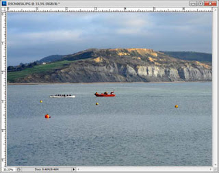
I changed the midtones using the Levels again; you have to be careful not to
overdo it as the image can look unnatural.
 |
| Mid tones adjusted |
 |
| Mid tones adjusted |
Compare the two images
The original
image is pale and has a bluish haze; the final adjusted image has a much more
interesting colour and definition.
 |
| Original image |
 |
| Levels adjusted image |
RAW
Original RAW Image
The original image in RAW which
you can see below through the RAW Plugin converter in Photoshop CS5:
If
I change the setting from default to Auto Adjust you can see quite a dramatic
change to the image:
· Recovery from 0 to +1
· Blacks from 5 to 70
· Brightness from +50 to 0
· Contrast from +25 to +50
If I
change the settings manually one at a time you see the following changes:
· Adjust the black point and the white point by adjusting Exposure:
The red warning areas have come on to indicate that
there was very little detail on the side of the white rowing boat and the
yellow buoys. I moved the scale to +70 on the Recovery slider and this retrieved
enough information to eliminate the red, blown areas, see above.
I
adjusted the Exposure to correct the mid-tones and found that by taking the
reading up to -1.00 it made the whole image darker but this was corrected in
Contrast when I changed the reading to +86.
· Assess and if necessary adjust the contrast. Experiment with Tone Curve:
I
changed the Highlights, using Tone Curve, to -43 but had to decide how much to
reduce as, when I took it too far to the left, some of the figures took on
a blue hue when they should have been black.
I made the Lights +46 as this lifted the image and although it looks
dark in the screen shot above, it is considerably lighter when saved as a TIFF
or JPEG file.
I
changed the Darks to -12 and I altered the Shadows only slightly to -15 as too
much darkened the picture too much.
I
saved it as a TIFF file in case I wanted to make any further corrections using
Levels or Shadows/Highlights, but this is the final image from the RAW file.
 |
| JPEG final image |
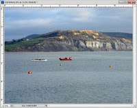 |
| RAW converted final image |
Whilst
the RAW image is still slightly darker than I would like I managed to retrieve
much more detail using the RAW converter software than by using Levels and
Shadows/Highlights for the JPEG image. i can adjust the darker image using Levels.
Sunday, 8 January 2012
Exercise 13: Managing Colour
Find
two or three images that have a significant colour cast as the main purpose of
the exercise is to ‘correct’ it. Make
sure that at least one image contains a surface that is ‘known’ (that is,
expected) to be grey. Among such grey
surfaces are concrete, steel, aluminium, car tyres, asphalt, thick clouds and
shadows on white. First examine the
image and make a judgement on the colour cast.
Then use your processing software to adjust both images to a
satisfactory state.
JPEG
Here’s my original image with one with a purple cast from using Fluorescent white balance.
This café image has a very distinctive purple colour cast so I needed to remove it by firstly using the grey point in Levels, see below:
I think it would be virtually impossible to remove the colour cast from the notices in the window but I used the Magnetic Selection tool to selection just the notices and used the Colour Balance palette to make additional changes.
The additional changes I made were:
---------------------------------------------
Final
RAW converted image:
Using the RAW settings enabled me to get a more realistic image than from the JPEG image and having to work on it after I had opened it. The RAW image stored information which could be changed more easily and successfully.
JPEG
Here’s my original image with one with a purple cast from using Fluorescent white balance.
 |
Image with Auto in camera white balance
|
 |
|
Image with Fluorescent
white balance
|
JPEG
Procedures
This café image has a very distinctive purple colour cast so I needed to remove it by firstly using the grey point in Levels, see below:
Even
with this the picture still has a distinctive purple cast so I opened up the
Colour Balance palette and adjusted the three sliders to eliminate it as much
as possible. The new readings were:
Cyan/Red -6, Magenta/Green +4, Yellow/Blue +15
I think it would be virtually impossible to remove the colour cast from the notices in the window but I used the Magnetic Selection tool to selection just the notices and used the Colour Balance palette to make additional changes.
The additional changes I made were:
Cyan/Red -30, Magenta/Green +47, Yellow/Blue -30
These
do seem to have restored the notices to a more natural colour as you can see
from the Closed notice which should have been white but still retains the
purple cast.
Here’s
the before and after pictures to compare:
 |
| Before |
 |
| After |
RAW
This
is the image again with the Auto white balance as a point of reference
 |
| Original image |
You
can see that there is a large amount of red in the picture, indicating that
there is very little detail in those areas.
See screenshot below to see background details in the image:
I
used the sliders to alter the image and remove the purple cast in the following
amounts:
Recovery
25, Blacks 2, Brightness +47, Contrast +19
And
the image changed to a more balanced colour way:
Using the RAW settings enabled me to get a more realistic image than from the JPEG image and having to work on it after I had opened it. The RAW image stored information which could be changed more easily and successfully.
Subscribe to:
Comments (Atom)


